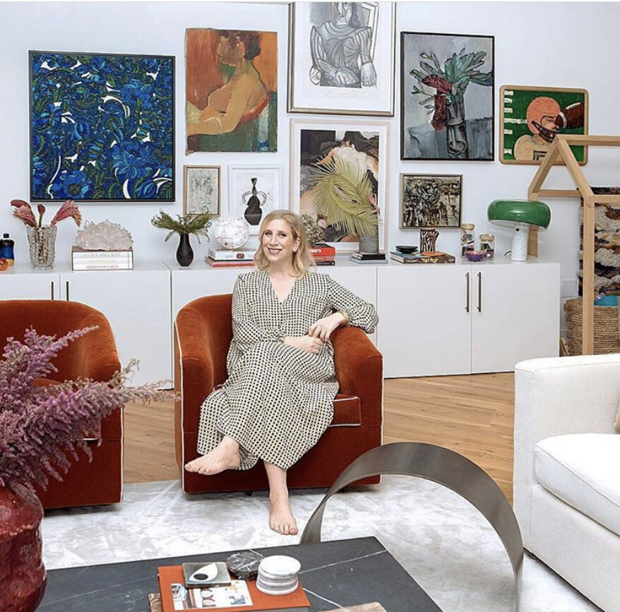
I know we are not the only ones completely girl crushing on Kelly Wearstler. Let’s breakdown why we love her:
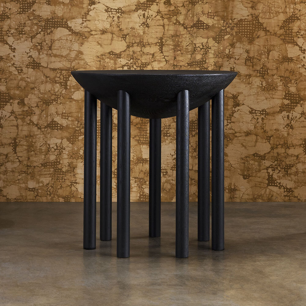
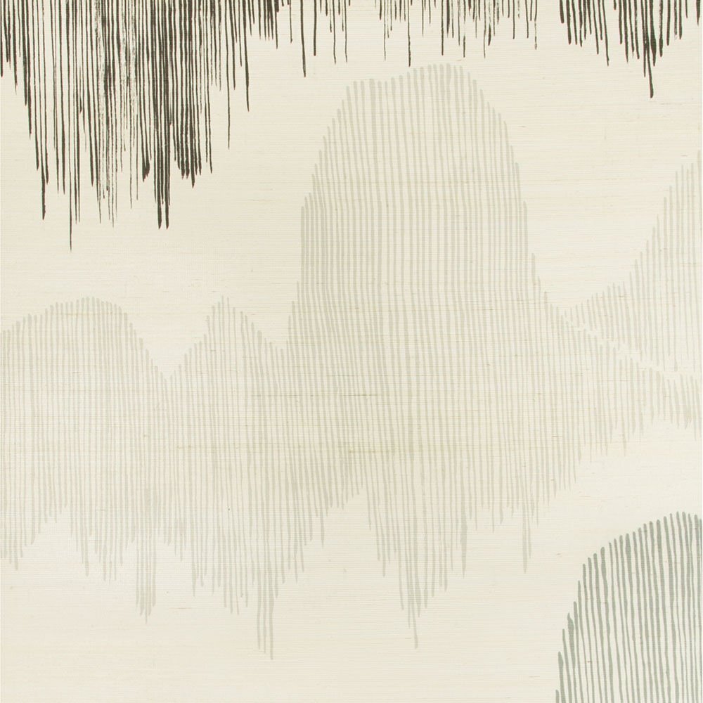
The Colors Are Just Right. She has an innate balance and eye for the right color. For example, it always seems like fresh new shade of cream. She is not inviting the wheel; she just demands for excellence in tweaking until it in 100% right.
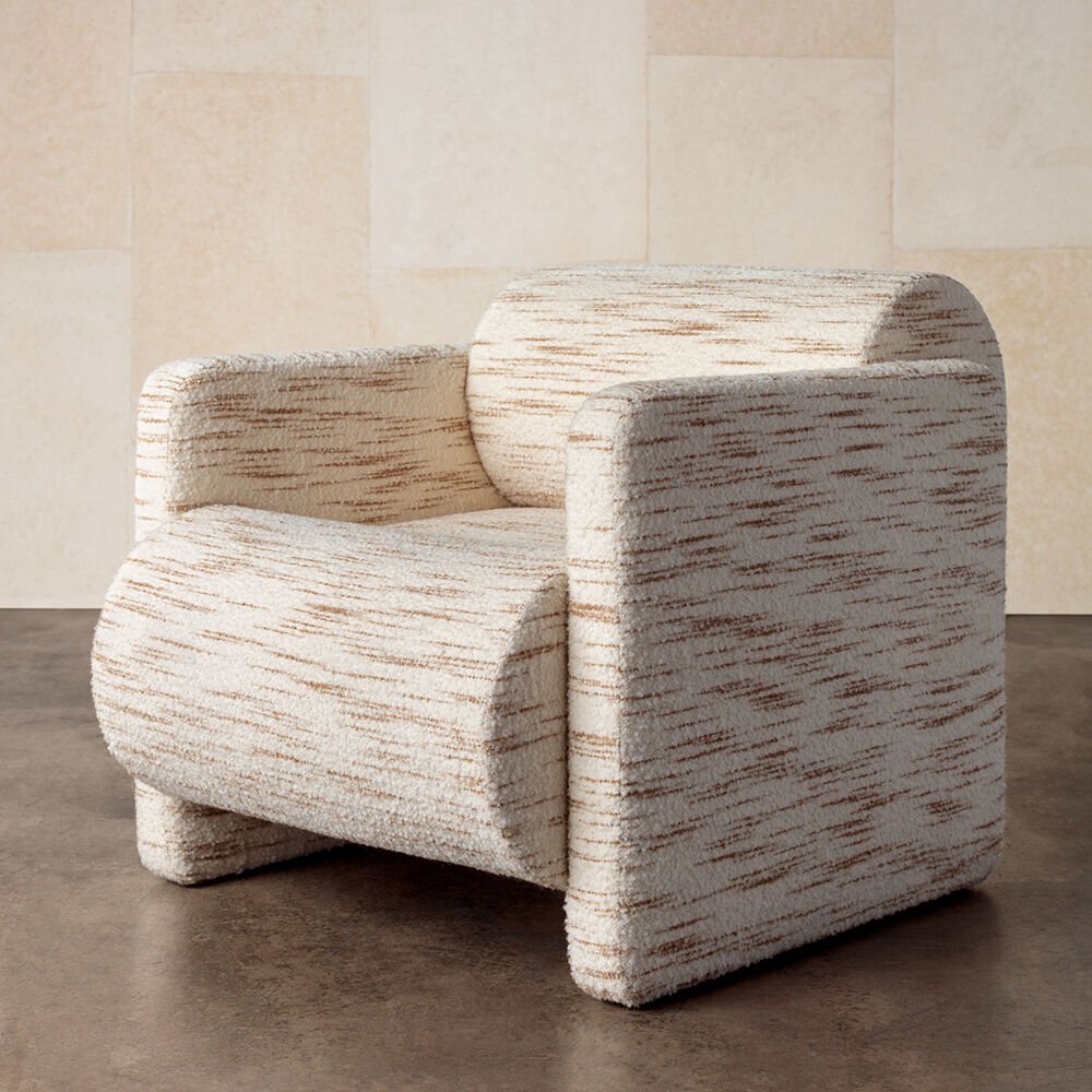
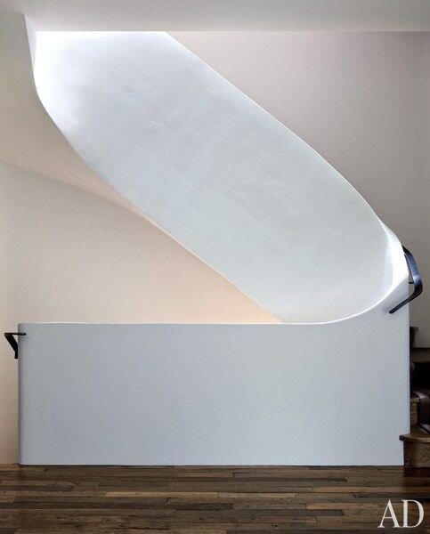
The Proportions Are On Point. She plays with scale, that is with intent and creates interesting visuals. For example, by creating a back of a chair that seems oversized and even disproportionate to the rest of chair is interesting.
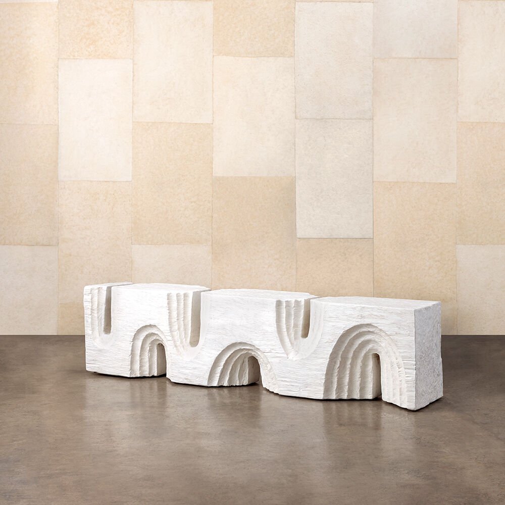
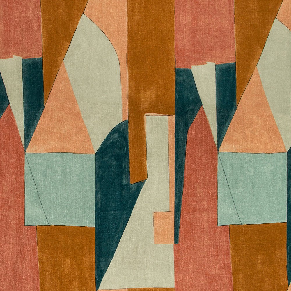
Draws From History. She pulls inspiration from line, shape and textures from her travels to Morocco, France and Italy, etc. If you know architecture the lines she uses are simple shapes distorted, again by scale, to create something innovative. She also pulls inspiration from vintage pieces from the 60’s, 70’s and 80’s. These are not decades that have been reworked so much that they seem tired. Unlike our friend mid-century modern, that has been living among us for 20+ years. It is so dead. The 70’s and 80’s feel fresh again. Of course she is also extracting the best parts of your eras and modernizing it.
