Author: Sydney Piwowar
For those of you who are inspired by the seasons and the changing of colors, like me, you are probably trying to figure out the best way to bring these fall and winter colors into your home. I’m not talking about tacky turkey napkins and paper gourds I’m talking those beautiful autumn shades of burnt umber, cadmium yellow and deep reds.
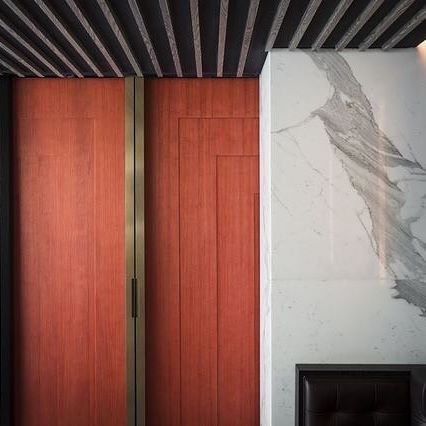
I love Brian Paquette Interior’s application of the deep and bold coral colored door juxtaposed by the darker ceiling. It is the perfect balance of visual texture.
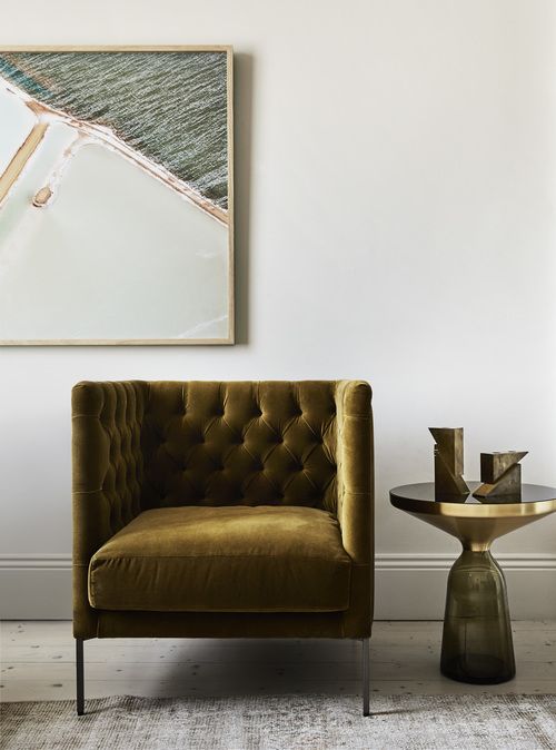
Embrace the warmth and rich tones of fall, all year with warmer textile colors choices. There are other neutral color options other than gray, that are classic and will stand up over time. I love this example of a burnt ocher used by Tempelton Architecture.
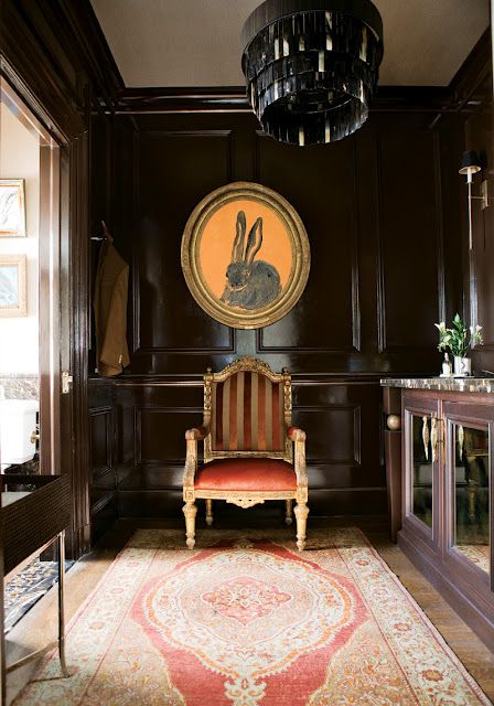
Be bold! Paint is just paint. It is not like a bad hair cut that will take months to grow out. If you don’t like the paint color- paint over it. But it’s important to have fun and take risks in your space, as Fernandez & True Interiors did here in the 2012 Atlanta Show house. Of course, we cannot change our furniture to match the season like we do our wardrobe, however, if you are craving to add something new, check out your local antique stores for a special piece that can temporarily freshen up the color palette.
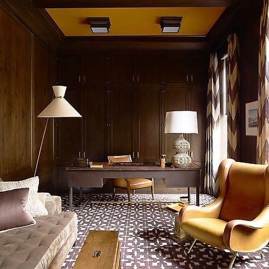
Every space should be an extension of that person. We have different facets of ourselves; likes, interests and passions. Your home can become an exploration of those layers. I love this office designed by Steven Gambrel that seems to visually explain that person. This space is so well composed, I can almost imagine the story and background of this person.
