I love the mix of high and low. This combo inevitably creates an interesting visual of texture, line and color. Tapping into the classic lines of a vintage piece mixed with something new is really exciting when it’s done right. One of my most creatively challenging projects, which ultimately became the most rewarding, was a project I did for the historic Poppy House in the Kenwood neighborhood of Hyde Park – Chicago.
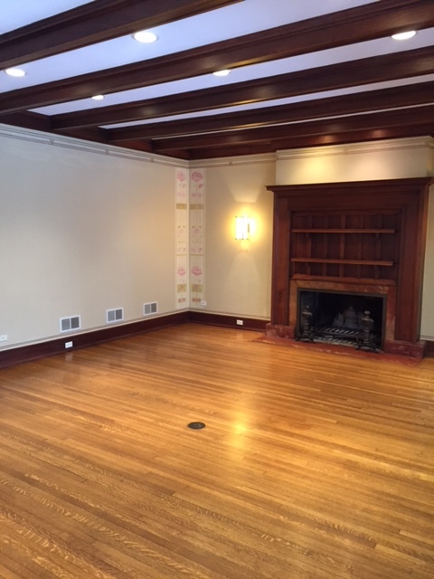
We could not touch the woodwork, because of the historic value and the house is on the national historic list. As you can image in a prairie style, Frank Loyd Wright inspired home, there is a TON of woodwork, so my biggest challenge was to embrace it and incorporate it. I needed to bring it into the 21st century and blend with my clients modern, eclectic aesthetic.
Starting in the Living Room, we covered the sections of ceiling between the beams with deep mocha colored grass cloth, updated the wall sconces and painted the walls a cool tone of cream to draw out the yellow from the room and covered up the dated flowers painting in the corners that was added by the former owner in attempt to “update.”

I wanted to create a space that balanced out the history of the space and was a slight nod to the 60’s, pulling in creams, warm leather and a pop of jade green. The coffee table we found on Charish and the other pieces were custom created for the space.
For the family room, which is a part of an addition added in the 80’s the woodwork was not a factor. We had more of a clean slate to work with and started by ripping out the dated built in, creating our own custom floor to ceiling built in. We painted the walls, molding and built in all Hale Navy, which created an elegant streamline look. The modern cranberry velvet chairs were mixed in with a new sectional, silk rug from ABC Home and petrified wood stump side tables.
The other major change we made was to the dining room and added Philip Jefferies grass cloth wallpaper on the walls and cove ceiling to create a dark supper club look. The light fixture became a sticking point once the room was finished. My client had a hard time letting it go even though the size and proportions were all wrong for the space and was the last piece of the puzzle to creating an amazing space.


