Author: Sydney Piwowar
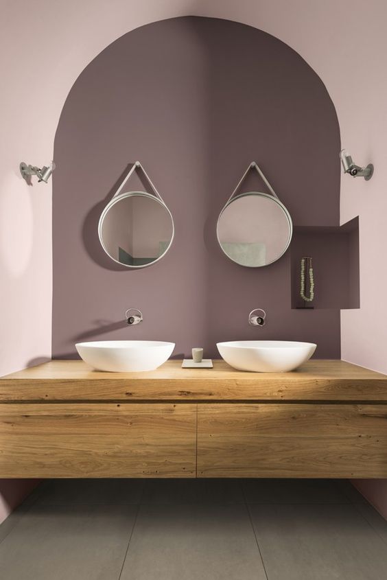
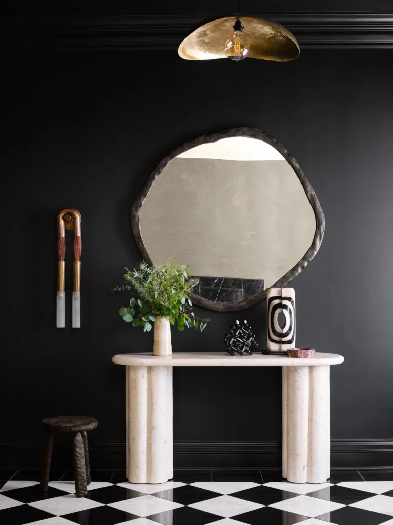
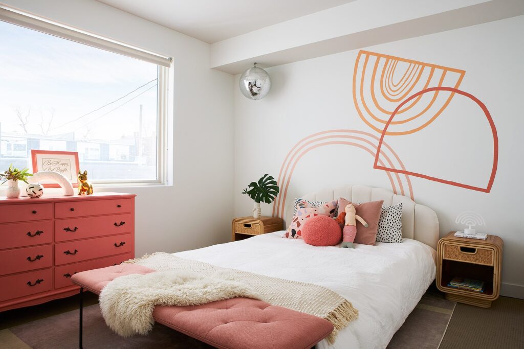
Something designers across the board talk a lot about is color depth. Whether that is in space, graphics, photography, fashion, etc. it is all very similar. In interiors, people often confuse color depth with having lots of colors. The more is not always merrier people! These monochromatic palettes have me falling in LOVE. Despite each room essentially being painted shades of the exact same color, it creates a sense of visual and architectural depth to a space in a way that just painting it all one color won’t do. Take a look at these Inso images to see for yourself!
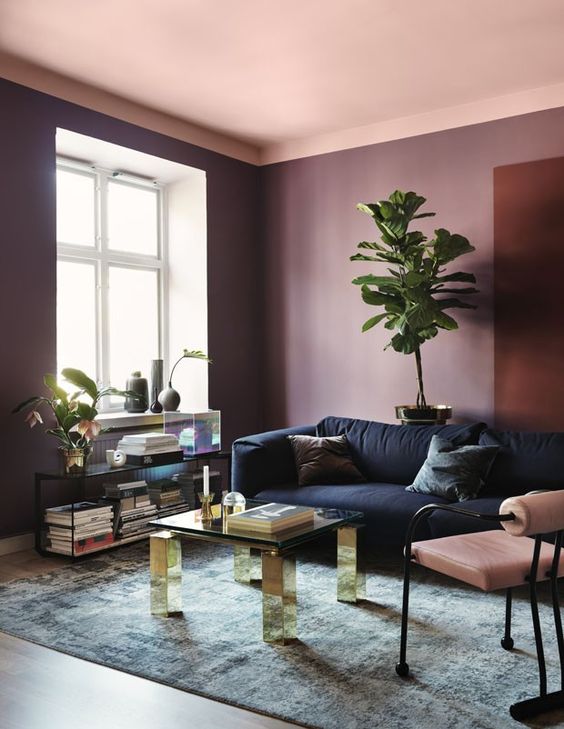
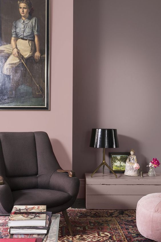
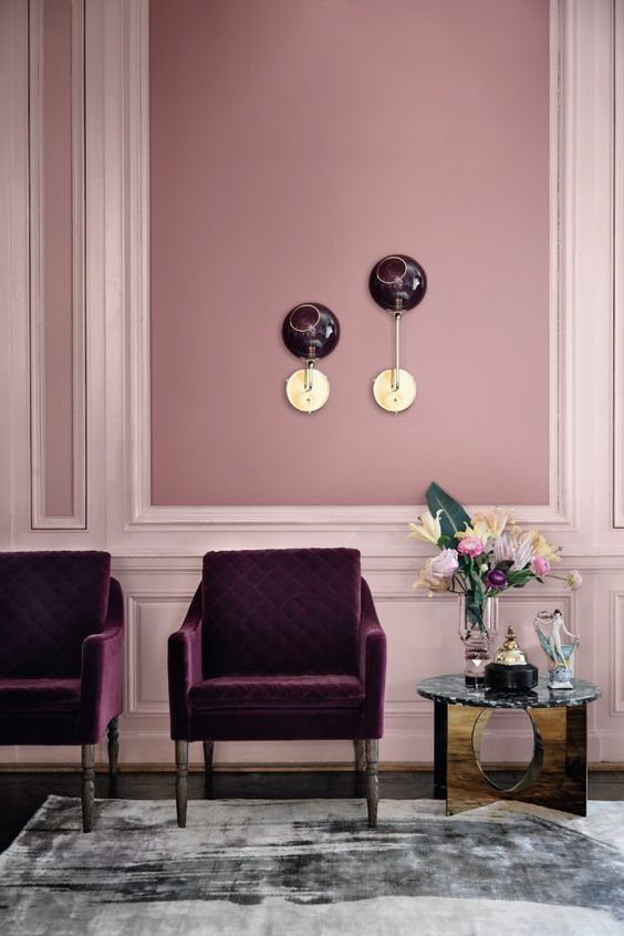
I absolutely love the way these different paint colors highlight the architectural significance of this wall. Traditionally, people would choose a floral wallpaper to pop in these panels. I have never been a fan for the obvious choices though — be bold, be different.
This picture needs no introduction. What a great way to highlight the unique arch of the ceiling without drawing the attention up and away from the bathroom features.
