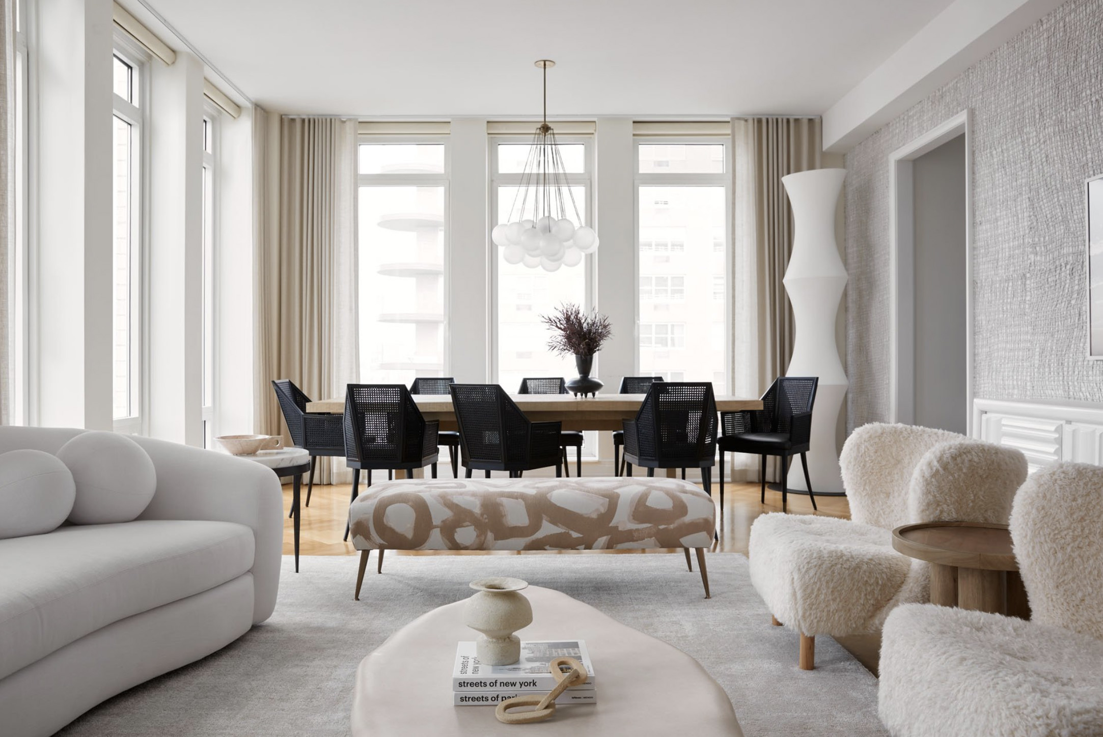
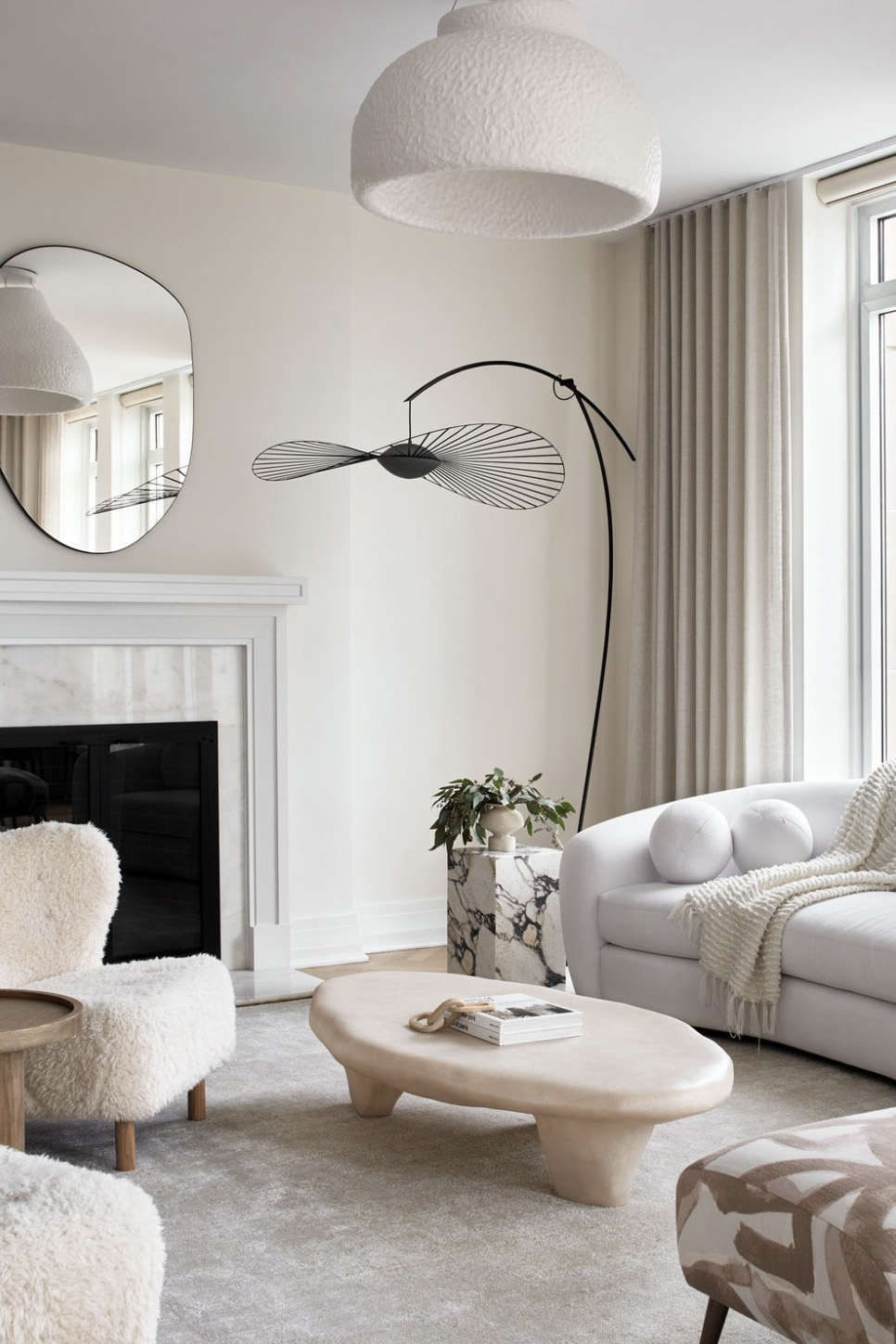
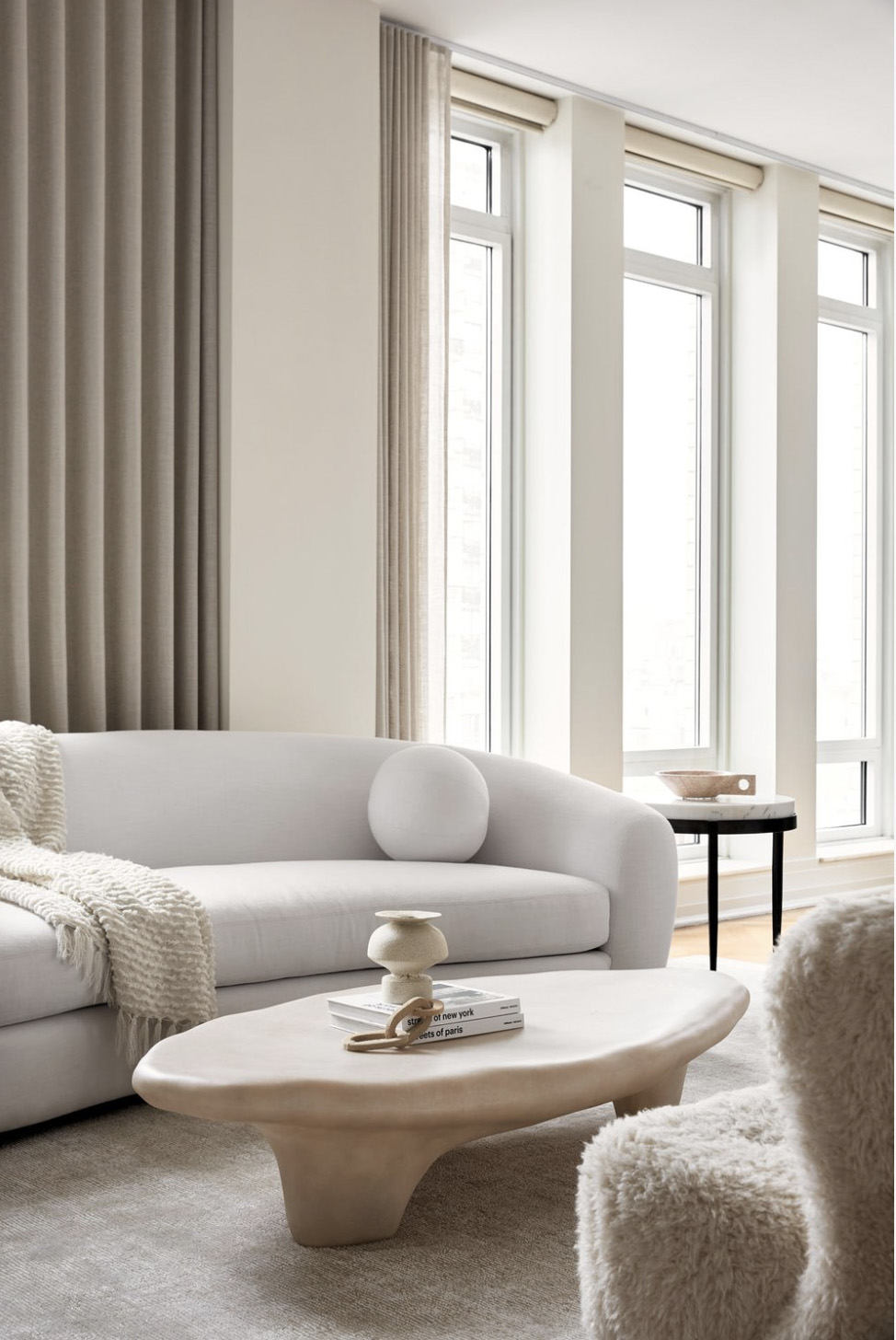
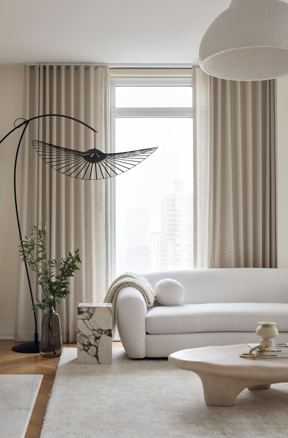
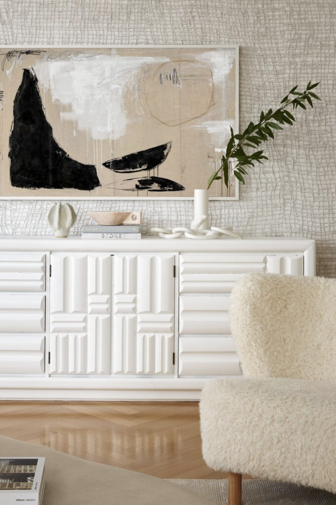
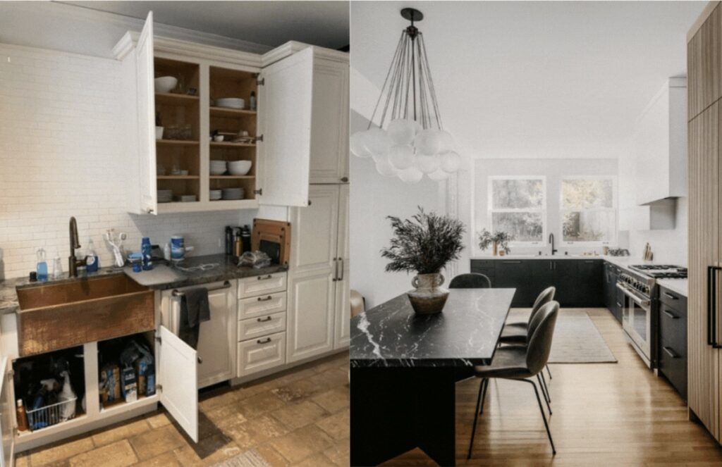
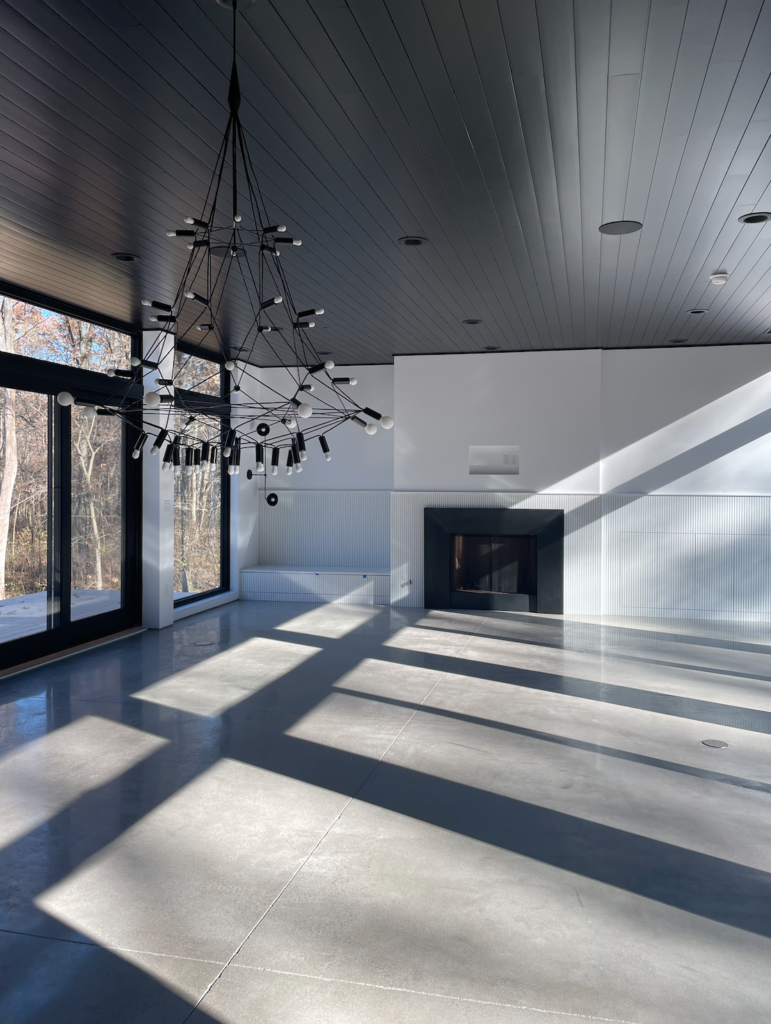
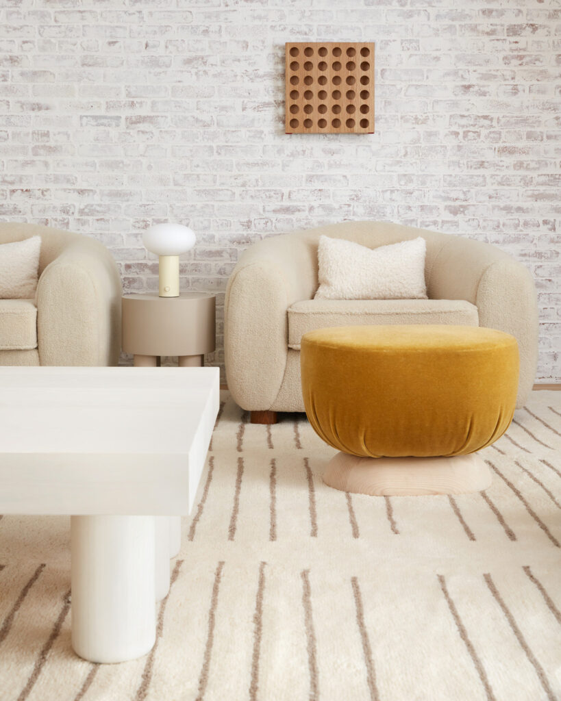
I have an unspoken formula for creating balance in design. I liken it to creating a painting and see each space as a compressed composition. Critical to not get stuck using all the same type of shapes. Meaning be sure to incorporate some solid, some open, some woven or irregular, some angular. If there are too many pieces that are similar the space can become one note and stale. I like to also use color or the absence of color to function as a visual catalyst. Apply color carefully and thoughtfully.
